Wednesday 4 May 2011
Tuesday 3 May 2011

Contents page original picture


This is my Original contents page picture which i edited by using the magic wand tool on photshop to cut out the band and paste it onto a brown back ground which constructed my contents page layout
Thursday 28 April 2011
Music Magazine Contents Page


Music Magazine Front Cover

Wednesday 23 March 2011


Tuesday 15 March 2011
Planning
Actor List
Danny Mc
Liam Rudge
Costume list
DMc
Leather Jacket
White T - Skull Pattern
Black Skinny Jeans
Grey Vans
LR
Black Beetles T shirt
Black Fedora
Black Skinny Jeans
Red Supra Trainers
Venue List
Liam Rudges Garage
Coronation Road
Winstay Avenue
Friday 11 March 2011


Wednesday 9 March 2011

Wednesday 2 March 2011
magazine pictures


These are the Pictures I took of My Band. I used a tripod platform as my band only consisted of two people so it meant i had to be in the Photoshoot. I Have done some Slight contrast changes on photoshop and effects such as black and white on certain images. I beleive that too much editing on the pictures for the magazine decreases the effect of the images so i did not insert any uneeded edits keeping the effect of the pictures as realistic as possible. In Order for these pictures to be pulled off it required some caution as stunts were involved for certain images. The Image which took the most effort to capture was my Front cover picture were my band is Skateboarding down the street whilst playing guitar. My idea for this picture came from the slogan 'on the road' which directed me to the idea that in real life theory a young upcoming band would not have access to vehicles at first and Skateboarding to gigs would be a possible outcome.
Friday 25 February 2011


Wednesday 23 February 2011


Tuesday 22 February 2011
Contents page mock up

This is my sixth form magazine mock up of a contents page for my magazine. This is includes a large text box which will include information about the pages and what pages they can be found. This also includes two pictures and a puff to attract the reader. A main header is used to identify that it is the contents page and a main article picture will be used which is in relation to the main story. the image will take up a large portion of the magazine.
Front cover analysis

This is my analysis of a magazine front cover. i Have chosen to use the rolling stones as it fits into the genre of music i have chosen. The anaysis identifys the key features of the front cover.
Monday 21 February 2011
College magazine analysis

Friday 11 February 2011
School Newsletter analysis


In class we Analysed two different school newletters which were two completely diffirent schools. We discussed in class the features which the newltters consisted of which made thew teask subsiquently easier as we were develping skills towards are terminology.
The first newletter we analysed was the one on the left which is used for Deyes High school. Fristly the Font styles are Large and Bold which i beleive is used as a way of covering space as the newleter has had little effort in producing. the main picture of the newsletter is a pencil drawing of the school. the image gives and impression of suitability and consistancy witin the school as it looks like it produces good mannerisms, however the picture is outdated and does not look very appealing to the audaince. The Masthead is simple the name of the School and has used a puff, to show the schools speciality in Science. and has used a large serif Font. Another image used on the newslettwer connotates science which is in relation to the Puff. The Newltters colour is plain and has n oringinality. it shows lack of effort in producting it. the Deyes High Deyes High School badge is also present on the newsletter in the form of a large scale watermark which makes the badge discrete but also brands the publication as an offiicial Deyes newsletter. To improve the newsletter i would completely change the layout style as it needs to be more appealing to not just the pariental audiance but also the student audiance.
The second Newsletter i analysed was the St Ambrose Barlows Newsletter which i beleived had a more suitable and appealing layout. the use of colour genreates the sense of fun and happyness which is what is expected for a school. The magazine uses a typical Red top masthead which relaes to other publications such as The Daily Mirror giving a more professional feel to the nwsletter. The Red is also used on the puff were it claims to be a specialist sports collage, and the use of red connotates Health which is used to relate to sport.
The newsletter also incorporates a contents column down the side of the newsletter which attracts the reader as it presents the content of the newsletter straight away. The badge of the school is also included and placed in the top right hand conrer. the layour is frther layed out in a newspaper style as it includes a use of headings and the article text is displayed in columns. the coloumns give a sense of formality which can range from appealing to both students and parents. The St Ambrose Barlow newsletter could be improved if the layout was positioned better and did not look as chaotic and did not have seasonal drawbacks as this issue only realtes in summer time 'Summer eddition'.
In conclusion both newslletter front covers could be greatly improved through relevance and content features, however the use of colour and formal layout of the St Ambrose newsletter in my oppinion makes a far better front cover as it contais features which exaspulrate the audiance far better than of the Deyes High Newsletter
Wednesday 9 February 2011
Cohens moral panic

Features of a moral panic:
- Concern - behaviour of a particular group is seen as a threat
- Volatility - the situation erupts dramatically
- Hostility - "folk devils" are constructed to create a diversion
- Consensus - widespread acceptance of this threat
- Disproportionality - wild exageration of the evidence
However we can all agree he was a legend.
Semitoics
A theorist called Saussare stated that in everything there is a sign and signified. If Darkness and rain is the sign, then Saddness is signified.
Connotation - What can be suggested
Denotation - What might be seen
Connotation - What can be suggested
Denotation - What might be seen
Feminism
Feminism is a representitive theory in which women believe that they should be treated equal to men. For example they believe they have the right to equal pay, equal rights etc. Feminists would see the media as disempowering women as they are hardly included as the lead protaginists in film and media productions, protagonist roles are usually assigned to men who carry the macho image that is required to fit into the mainstream.
The Theory
Academic feminist theory emerged as a response to the activism that became popular during the 1970's. Laura Mulvey's male gaze is often considered to be the most recognised and accurate theory that is put into practice. In film the male gaze consits of taking a viewpoint from a male's perspective in which a woman may be objectifed, for a example the camera may focus on the curves of a woman's body. Thus showing how women are often objectified and considered passive objects in both film and the broader media outputs.
The media is considered by feminists as being constructed for men. It is sometimes viewed as a Patriarchal society in which men command the power and women are subordinate, this is often portrayed for example in a police drama where men are in a position of power over women, such as being higher rank.
Friday 4 February 2011
Narcistic identification

This is an Image of a Rolling stones magazine with Led Zepplin on the cover.
Narcissistic identification demands identification with the object on the screen through the spectator's fascination with the recognition of his/her likeness.
Terminology
Masthead: Name of the magazine
Motto: Memorable phrase that is recognisable to a brand
Buzz Words: "Wow", "Exclusive", "Free" are all examples of this.
House Style: A magazine's distinctive design that distinguishes it from its competitors.
Puffs: Colourful boxes promoting features inside.
Strap Line: A slogan
Banner: Text which stands out on a coloured background generally at the bottom of the magazine.
Copy: The Main Story in the Magazine
Anchorage Text: The way in which text helps to pin down the meaning of a picture and vice versa.
Pugs: Placed at the top left and right corners of the paper and are known as the 'ears' of the page. The price of the paper, the logo or a promotion are often positioned there.
Headline: Catchy Title for the main article
Sell Lines: Text on the front cover that helps to sell the magazine to the audience
Caption: Description of the main image
Lead: The introductory paragraph of an article. Usually written in bold or capitals.
Drop Capitals: Really big letter that starts off an article
Analysis of the same genre magazine

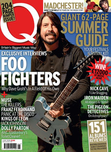
This blog entry is too show how the two magazine covers for Q have the same genre. The bands included in the magazines are greenday and Foo Fighters. therefore showing that the genre of the magazine is alternative rock. I will explain the hourstyle of the two magazines identifying the similarities and how the magazins are the same. The first thing that is similar between the magazines are that the image is overlapping the MastHead. this is the same for both magazines as it shows how the band is the selling the magazine as they are what the fans will want t read abut. The MastHead is the logo of Q magazine and it is placed in the tp right hand corner, another similarity. The semiotics of the magazine are also similar as the colours are red and white for the font colours. the backgrounds are both reasonably green and the font styles are also the same. with a use of large writing. The layout is also similar as unlike other music magazines such as kerrang the positioning is all fairly evenly spread whilst kerrang is very clusterd.
College Magazine Draft layout

This is my draft layout for my collage magazine that i have made on paint. This includes Masthead, Images, banner, Main Headline, and mottos
Thursday 3 February 2011
Mood Board
 |
Tuesday 25 January 2011
Welcome to my Blog
Welcome to my AS media blog
I am going to be updating my worker on this blog and i will include a number of diffirent analasis, this will include things such as Musiuc magazine covers, content page analysis and double page spread. i will also include an analysis of a front cover. I will be examining varied choices in representation in Alternative rock genre, using magazines such as Kerrang, Q and NME to see how the publishing and layout choices can help me to produce a quality analysis covers which in addition will furth my research for my music magazine and make it a more substantial product.
This is my questionnaire please complete here
Subscribe to:
Posts (Atom)